happy trails to you

How AMAZING would it be to have your own artwork licensed and printed onto kids clothing... a.k.a children's apparel? I think it would be pretty darn sweet. This is one of my goals/dreams as well as a favorite market of mine. I love perusing through (& saving) the Tea and Boden and Garnet Hill catalogs when we get them in the mail. I also love DPAM which my friend who travels to Paris quite a bit has turned me on to. And, while there are no more Olily shops in the states anymore, (boo) I still have quite a few of their old catalogs saved as well. 

Our theme in my MATS class this week was "camping". I created a little world of camping animals (& miscellaneous props) on an water and land adventure. I featured feathers and fireflies. I drew a TON and printed some background textures. Due to some other work deadlines, I did not have as much time as i liked to spend on this but I am pleased at the final. Would love to hear your thoughts!

PS who wants some s'mores??? 

"camp it up" artwork for children's apparel |  by bz designstuff

"camp it up" artwork for children's apparel |  by bz designstuff

ooh - its a blog parade!

So, the Making Art that Sells  class I took back in July and part B which starts up again in a few short weeks (yay!) has made me do all sorts of things...

First it made me make CRAZY amounts of awesome artwork in 6 short weeks...

MATSReview.jpg

Aftwewards, I purchased some video seminars from Surtex, as Lillas class made me realize I would like to build up a portfolio for licensing and surface pattern design.

Then to keep the creative juices flowing, I signed up for a fabulous and fun painting e course (currently in progress) called Daring Adventures in Paint. Here are a few of my favorite in progress paintings.

untitled acrylic paintings, 10" x 10"  4 of my in progress paintings for the class - Daring Adventures in Paint - taught by Mati Rose McDonough 

untitled acrylic paintings, 10" x 10"
4 of my in progress paintings for the class - Daring Adventures in Paint - taught by Mati Rose McDonough 

Then I entered a surface pattern design competition

Then I ran my first half-marathon.  (Wait - that's not related... but I wanted to share!) 

And today I am in a blog parade... It's all due to a wonderful (and private - sorry!) group which exists only online, and has emerged from the Making Art the Sell / Lilla Rogers' e-course. This international group of like minded artists has provided wonderful feedback and support and has been a valuable resource during and since the course. I have friends & supporters from all around the globe and it is a wonderful and vibrant - and ÜBER ÜBER ÜBER TALENTED - community.

I thought I would use this post as an opportunity to share here a few things I've been working on. 

Some recent design projects include: a few small brochure projects for Haverford College, a logo refresh for a NY law firm, a brochure for a company which specializes in home renovations, a poster for a public art project celebrating Mental Health recovery, a brochure for the awesome Fairmount & Queen Village Art Centers (in Philly) and last but my NO means least, a super fun illustration project! 

Map of Media, PA for Main Line Parent Magazine  |  illustrated by Barb Chotiner

Map of Media, PA for Main Line Parent Magazine  |  illustrated by Barb Chotiner

This family fun guide / map of Media, PA was something I Illustrated for the new issue of Main Line Parent magazine. That was a pretty fun job, as well as a labor of love!

Thanks for reading my words & please now get your little mouse or wacom pen & head on over to Julia's blog (aka MOOGBEE)! Julia is a super nice and super talented artist who also lives in the fine state of Pennsylvania. 

A final notes... thank you Linda for setting this BLOG PARADE up. And - a long overdue thank you to Ashley @ the Smash Works for including me in her showcase of Global Talent Search submissions.

Happy Monday Everybody!

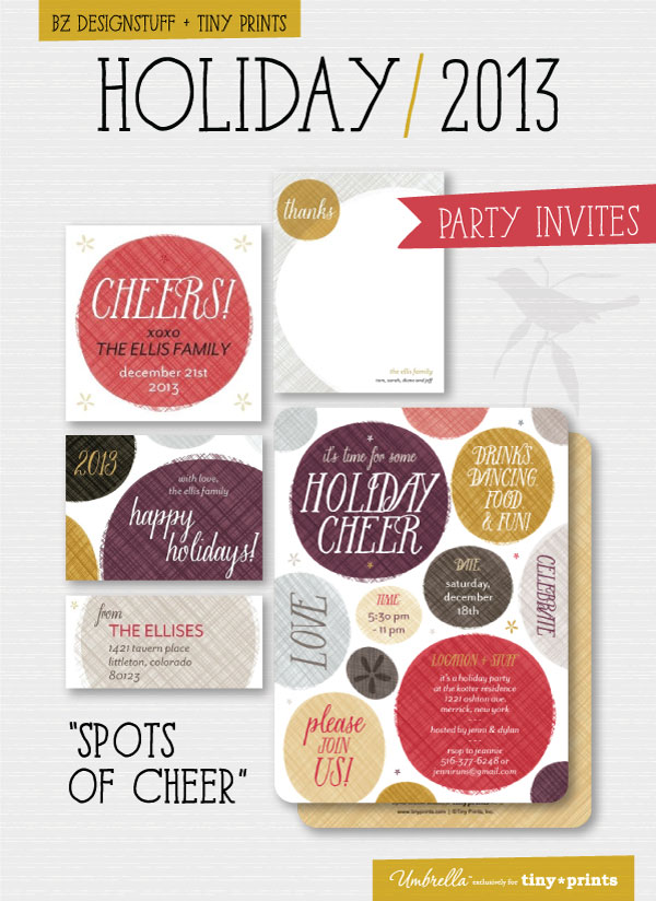
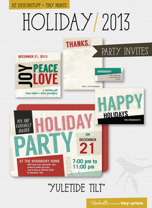
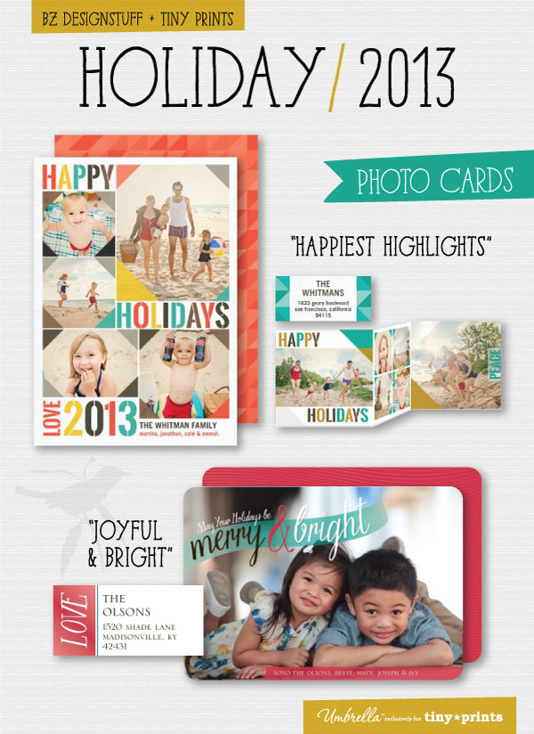
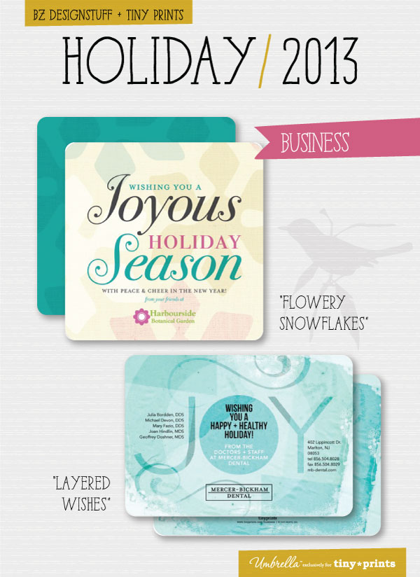
happy birthday

Some new designs for birthday invitations. Get yours here

birthday invitations for tiny prints

birthday invitations for tiny prints

gts - it's a process!

The finalists for the Lila Rogers Global Talent Search were announced yesterday. 50 were chosen from 1500+ submissions. (yowsers!) Unfortunately, I did not make the final cut. However, I was pleased that so many of my fellow MATS classmates did. (More than half I think!) Way to go you talented gals (& guy)!

I wanted to share my process and my entry in hopes to get some feedback. As you can see... where I started and where I ended are very different. This tends to happen and I feel now (as I have in the past) that something gets lost when I do my "finals." 

I had a blast with my initial sketching for the assignment. (Which was a 5x7 journal, for Paperchase (a fun & fab UK paper goods company) with the theme: vintage playground.) Phase 1 shows my favorite developed sketches of the bunch.

Phase 1 - sketching concepts

Phase 1 - sketching concepts

Then I started tightening up once of the sketches & added color: (phase 2).

I loved the dynamic composition but wasnt sure about such a large character being front and center, and you couldnt see the playground images. I also know her hair & eyes needed work! So... I revisited some of my phase 1 ideas.

Phase 2 - coloring

Phase 2 - coloring

Somehow I got very into the vintage metal playground spring animals & in one of those happy and delirious post midnight art-making moments, I created the art in phase 3. (In hindsight, perhaps I should have taken a chance and explored my new loose "smooshy texture + line drawing" style further and sent my final in this method.) It was done with printmaking, collage & hand drawing.

Phase 3 - a new direction

Phase 3 - a new direction

However, instead I did a bunch of drawings inspired by this above piece, and ended up with my final design submission: phase 4, shown below. I really focused on color, composition and character development. I wanted to make sure it read well small and kept your eye interested.

Phase 4 - the final

Phase 4 - the final

I was initially confident in my submission however, soon after I began to have my doubts. I could have pushed the coloring further. I could have perhaps cleaned up the subtle details. (i.e. eggs in the design for the rooster saddle, clouds for the toucan, carrots for the rabbit etc.) After a disappointing morning yesterday, I reread the post regarding the chosen few. It seemed very logical that one of the main factors for the narrowing down to the 50 was "a strong, evolved style."  I can freely admit that I am still trying to develop & find my own unique illustration style. While it is evolv-ING it is not yet evolv-ED, And, as I have been doing graphic design and art direction for 15+ years it is only recently that I am delving deep into the world of illustration, surface pattern design and art licensing.

And now with a good night sleep behind me - I find I am actually quite happy to be freed up to make some new art and take all the things I have learned in the past few months and put them into play. And so with this... I will more forward and draw some more. I will make more art. More prints. More projects. And joyfully still run my design business. And I will eagerly await October and Part B of MATS.  

And on a final note... in a non related email that also got yesterday morning (from my local hair salon which I love btw...) this quote was randomly mentioned. It was very apropos for the day and I'm pretty sure I have never quoted a president before! :)

"I will prepare and some day my chance will come." – Abraham Lincoln

I welcome any feedback & comments whether here below, or via email

Oh and thank you for reading my longest blog post ever. :)


lushy drawings

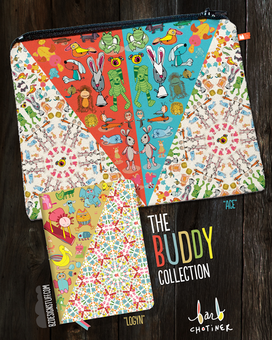
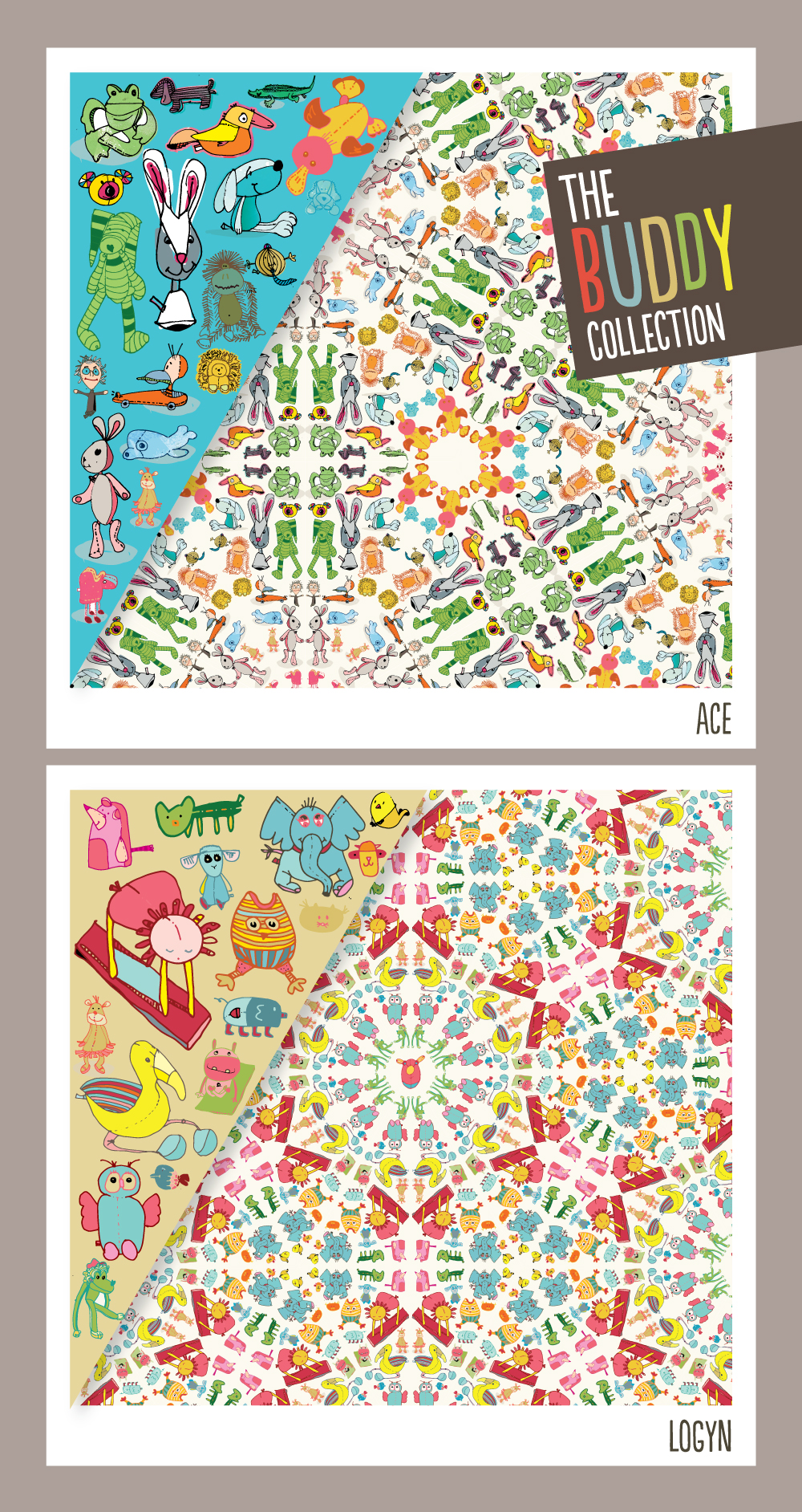
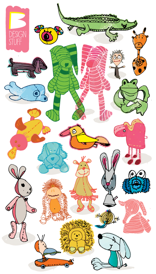
Hi - so on the final weeks of MATS class, we were to be inspired by our collections. I decided to raid the buddy bins of my 2 & 4 year olds and draw their plush little (stuffed animal) buddies. I can't tell you how excited they were to see "peaches", "flamingo", "seal" & others. Unfortunately I forgot to draw "Bora Bora" (he's a shark) but i'm sure he will make it into the next mock up! :)

I also decided this week to purely draw and not use my monoprints as I have been in doing previous weeks...

Be sure to click on the photo to see the detailed & process drawings.

the Snail and the Rose Tree

Book cover illustration for Hans Christian Andersen's The Snail and the Rose Tree. (Read the not so happy fairy tail here.) Created in conjunction with Making Art that Sells.

I'm not sure where this "smooshy texture + line drawing style" has come from - but i am totally digging it and going with it. I have an inside spread I have yet to finish but i hope to soon.

barbara_chotiner_theSandtheRT_week3.jpg